
This year for Fall 2016 Pantone decided to go with a few vibrant and tranquil colors.
Leatrice Eiseman Executive Director of the Patone Color Institude is quoted on the website
“The desire for tranquility, strength, and optimism have inspired a Fall 2016 color palette that is led by the Blue family.
Blue skies represent constancy as they are always above us.”
I would be writing about the Spring 2016 colors like everyone else right now, but in reality I live in Melbourne, Australia and we are heading into Fall, so it is sensible to write about what we should be looking forward.
So here are my finding straight from the runway looks for Fall 2016, all pictures were taken from <a href=”http://www.voguerunway.com” target=”_blank”>www.runway.com . These colors will make a way into your closet by this fall, I already have a few favorite. The airy blue and mustard yellow have been seen all over the runway including Spring 2016 runway looks. I feel like they will be dominating this year.
17-4028Riverside These pants are a perfect representation
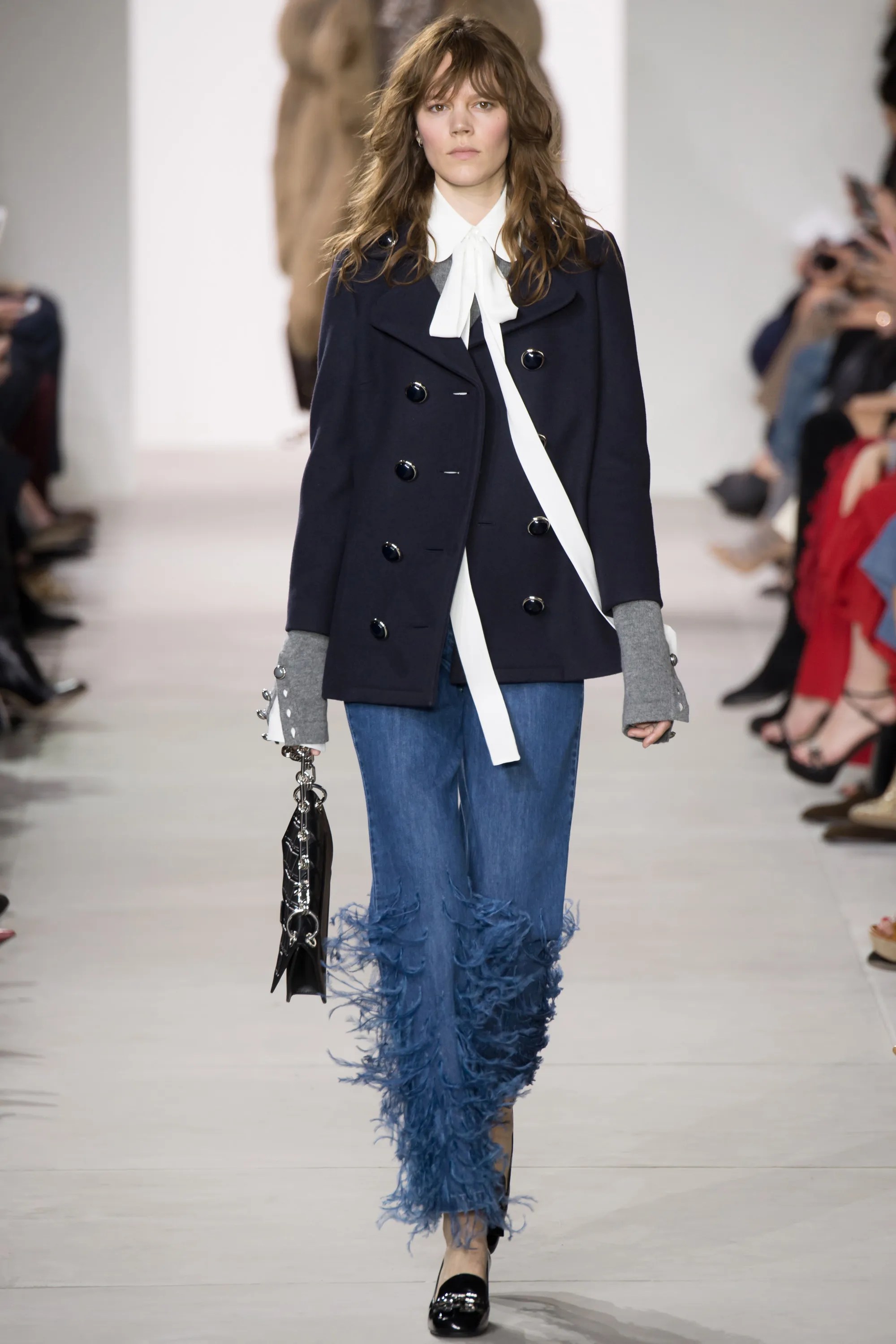
14-4122Airy Blue

17-3914 Sharkskin these pants

18-1550Aurora Red this dress has great flow and movement

16-1318 Warm Taupe loving this coat

18-1630 Dusty Cedar this top is an excellent example

18-5845 Lush Meadow this color has been a very tough one to find in any of the fashion shows, if any of you spot it let me know thanks.
14-0952Spicy Mustard I love satin and this dress is everything

18-1340Potter’s Clay This earthy tone is displayed in this jacket

17-3240 Bodacious the bright purple flowers on this jacket are this vibrant color


Awesome runway pics!
– Jessica
Miss Moore Style
LikeLiked by 1 person